
KDP A+ Content Sizes: Every Module's Image Dimensions
The minimum and recommended pixel size for each A+ module, the file rules that get images rejected, and a checker that tests your image against the module before you upload it. Written for books: novels, picture books, coloring books, workbooks and non-fiction.
On this page
Quick answer
The three A+ images most books need are a 970 x 600 header (Standard Image Header With Text), three 600 x 600 squares (Standard Three Images and Text, minimum 300 x 300) and a 1940 x 600 wide banner (Standard Image & Text Overlay, minimum 970 x 300). Save them as JPG or PNG, RGB not CMYK, at least 72 dpi, under 2 MB, with no animation, no watermark and no small text.
Those numbers come from KDP's A+ Content modules page and A+ Content guidelines. If you would rather not size anything by hand, Inkfluence's A+ Content generator writes the module text from your finished book and exports all five images at the recommended sizes.
The cheat sheet
A+ Content image sizes by module
Sizes in pixels, width x height. Every number here is from KDP's own help pages, checked 10 October 2026. Where KDP does not publish a size, the table says so rather than guessing.
| Module | Minimum | Recommended | Notes |
|---|---|---|---|
| Standard Image Header With Text | Not listed | 970 x 600 | 970 x 600 is the size the module is designed around. KDP's module page lists the module without a size. |
| Standard Image & Text Overlay | 970 x 300 | 1940 x 600 | The text box over the image is optional. |
| Standard Three Images and Text | 300 x 300 each | 600 x 600 each | Three square images, each with its own headline and text. |
| Standard Single Left Image | 600 x 180 | 600 x 600 | Image on the left, text beside it. The recommended size is square. |
| Comparison Chart | 150 x 300 per image | Not listed | Up to five ASINs side by side. Your own books only. |
| Standard Company Logo | 600 x 180 | 600 x 180 | One logo per layout. |
| Standard Image & Light Text Overlay | Size shown in the A+ Content Manager when you add it | Wide image with a light text box. | |
| Standard Image & Dark Text Overlay | Size shown in the A+ Content Manager when you add it | Wide image with a dark text box. | |
| Standard Single Right Image | Size shown in the A+ Content Manager when you add it | The mirror of the left image module. | |
| Standard Single Image & Sidebar | Size shown in the A+ Content Manager when you add it | KDP's page says to save images at the highest resolution (300 DPI). | |
| Standard Multiple Image Module A | Size shown in the A+ Content Manager when you add it | Several images in one module. | |
| Standard Technical Specifications | No image | No image | A table of up to 16 rows. |
| Standard Product Description Text | No image | No image | Up to 6,000 characters of text. |
| Standard Text | No image | No image | A headline and a block of text. |
KDP's module page says you can choose between 17 modules and use up to five in one layout. It describes the modules above by name; any others appear in the A+ Content Manager with their own size guidance. The header's 970 x 600 is the size the module is designed around, not a figure KDP prints on that page.
Header
970 x 600
Ratio about 1.62 to 1. Export at 1940 x 1200 for sharp high-density screens; same shape, four times the pixels.
Three squares
600 x 600
Ratio 1 to 1. Never below 300 x 300. Make all three the same size so the row lines up.
Wide banner
1940 x 600
Ratio about 3.23 to 1. Never below 970 x 300. Keep the subject away from where the text box will sit.
File requirements
A+ Content image requirements on KDP
Getting the pixels right is half of it. These are the file rules from the A+ Content guidelines that apply to every module.
| Rule | Requirement | What it means in practice |
|---|---|---|
| File type | JPG or PNG | Both KDP pages agree. WebP, HEIC and TIFF need converting first. |
| Colour mode | RGB only | The guidelines say the CMYK colorspace is not supported. Print files are often CMYK, so check anything that came from a print designer. |
| Resolution | At least 72 dpi | From the guidelines page. The module page suggests 300 DPI for the highest resolution. Pixel size is what decides sharpness. |
| File size | Under 2 MB | The guidelines page says under 2 MB; the module page says a 3 MB maximum. Under 2 MB satisfies both. |
| Animation | No GIFs | Animated images are prohibited. |
| Quality | Sharp, no watermark | Blurry or low quality images, watermarks, and small text that is unreadable on mobile are not allowed. |
| Uniqueness | Not in your image gallery | Images and text must be unique to A+, not the ones already in the gallery at the top of the page. |
| Alt text | Describe the image | Alt text that does not describe the image, or would not help a screen reader user, can get the content rejected. |
2 MB or 3 MB? KDP says both
KDP's module page says "The maximum image file size is 3 MB". The guidelines page says "Individual files must remain under 2 MB." Both are official, and they do not match.
You do not need to know which figure applies on a given day: an image under 2 MB passes both. At the recommended sizes a JPEG is normally a small fraction of that; the files that go over are usually photographs saved as PNG or exported at print resolution. The checker below flags 2 MB to 3 MB as a risk and anything over 3 MB as too big.
72 dpi, 300 DPI, and why pixels matter more
The guidelines ask for "at least 72 dpi". The module page, under the overlay and sidebar modules, says to save "at a high resolution (300 DPI)". That sounds like a conflict, but dpi is only a label stored inside the file. A 1940 x 600 banner looks exactly the same on screen whether its file says 72 or 300.
So work in pixels, then set the dpi field to 72 or more when you export. If your editor asks for inches, 1940 x 600 pixels is about 6.47 x 2 inches at 300 dpi, or 26.9 x 8.3 inches at 72 dpi: the same image. Print thinking (inches, 300 dpi, CMYK, bleed) belongs to your paperback files, not to A+.
Free tool
A+ image checker
Pick the module, then drop in your image. The checker reads the file in your browser and reports its size, shape, type, colour mode and weight against the module. Nothing is uploaded anywhere.
Checks
Largest crop at the module's shape
Crop maths: the largest crop at the module's shape
Divide the module's width by its height to get its ratio. If your image is wider than that, keep the full height and crop the width to height x ratio; if taller, keep the full width and crop the height to width / ratio. Then resize down to the recommended size.
Worked example: a 4000 x 3000 photo for the wide banner. The banner's ratio is 1940 / 600, about 3.23. The photo is 1.33, so it is taller than the banner: keep the full 4000 width and crop the height to 4000 / 3.23, about 1237 pixels. Resize that 4000 x 1237 strip to 1940 x 600.
No book yet, so no A+ images to check? Write the book first. Inkfluence AI turns an idea into an outline, chapters and a cover, then makes the A+ pack from the finished pages.
Start writing a bookModule by module
Which A+ modules to use for a book, and what each is for
Most A+ advice is written for physical products: batteries, blenders, phone cases. A book has different jobs to do. These are the modules that do them, with real images from three A+ packs made by Inkfluence: a literary mystery, a picture book and a health guide.
Standard Image Header With Text: the hook
Image: 970 x 600 shape. Export at 970 x 600 or 1940 x 1200.
The first thing a reader sees below your description, so it should do what a blurb's opening line does: make them want the next sentence. One image, one headline, one short paragraph. For fiction, show a moment from the opening chapters, not the climax. For non-fiction, show the reader's situation or the result the book helps with, in a real setting.
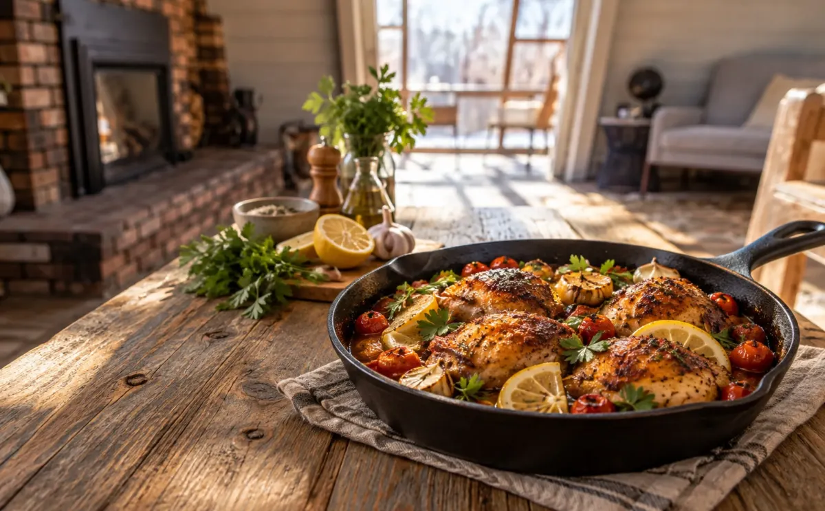
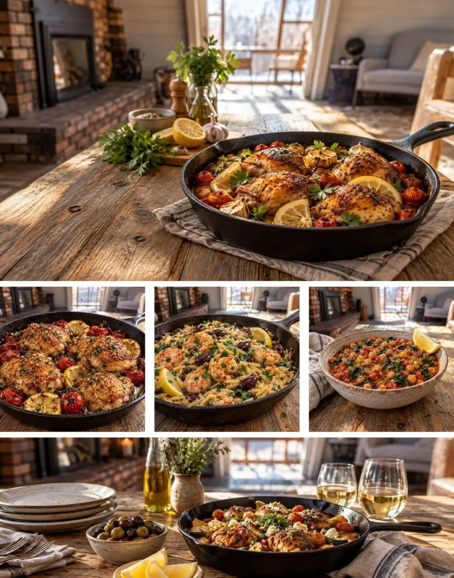
The header for One-Pan Mediterranean Dinners (shown at the top of this page) pairs the lemon chicken skillet with this text, quoted exactly from the pack:
Mediterranean dinners, made in one pan
Forty easy recipes bring bright herbs, lemon, olive oil, and satisfying ingredients to the weeknight table. Cook dinner in one pan, with simple steps and less cleanup.
The image carries no words: the headline sells, the picture sets the mood, and both survive phone width. If your book description already has a strong hook line, the book description generator page covers how to write one; the A+ headline can be a shorter cousin of it, as long as it does not repeat the description word for word.
Standard Three Images and Text: what is inside
Images: 600 x 600 each recommended, 300 x 300 minimum.
Three squares, each with a short headline and a sentence or two: what the reader will actually get. For a novel, three scenes in story order. For a picture book, three spreads that show the art style and the characters. For a coloring book, three finished pages so buyers can judge line weight and detail. For non-fiction, three steps or three parts of the method. The One-Pan Mediterranean Dinners pack uses the three squares for three recipes:
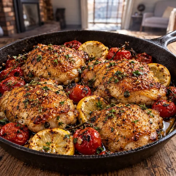
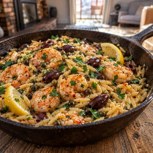
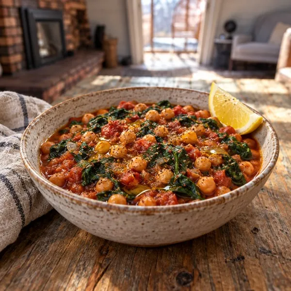
These three are the real 600 x 600 files. The captions are the module text from the pack, quoted exactly. Note the plain, concrete wording: each square names one dish and what goes into it, with no promises. KDP's guidelines say health claims need substantiation, so a health book's A+ should describe what the book covers, not promise outcomes.
Keep all three at the same pixel size and in the same style so the row reads as a set. If your book has interior illustrations, the book illustration generator and ebook images guide cover keeping one style across a book; the same style should carry into A+.
Image and text overlay: who it is for
Standard Image & Text Overlay: 1940 x 600 recommended, 970 x 300 minimum. Light and dark overlay versions: size shown in the manager.
A wide image with a text box over part of it: the right place for a sentence about who the book was written for, closing the section with a clear "this is for you". There are light and dark versions of the overlay; preview both in the manager and keep the one where the text is easiest to read over your image. The One-Pan Mediterranean Dinners cookbook uses it like this:

At 1940 x 600 the image is more than three times wider than it is tall, and a text box will cover part of it. Compose with that in mind: put the characters or the main object in the middle, leave calmer space at one side for the box, and avoid faces at the very edges. More on that in the mobile section.
Comparison Chart: the series
Images: at least 150 x 300 each. Up to five ASINs.
Up to five products side by side, each with an image and short facts. The guidelines allow comparisons only with your own books, so it suits a series: reading order, one-line premise, age range. A reader who lands on book two sees book one right there.
The image slots are tall: 150 x 300 is a 1 to 2 shape, narrower than most book covers, which are closer to 2 to 3. Place each cover on a plain background that fills the tall slot rather than stretching the cover to fit. Inkfluence's comparison chart builder exports cover tiles at 300 x 600, twice the minimum at the same shape, with each book's title and a one-line summary, and you add each ASIN in KDP. If you are planning a series, the book series writer and the guide to writing a book series cover the books themselves.
Single image and text: the author note
Standard Single Left Image: 600 x 600 recommended, 600 x 180 minimum. Right image and sidebar versions: size shown in the manager.
One image beside a block of text: a good home for a short note on why you wrote the book or the real place a novel is set, with an image of the landscape or an object from the story. A square 600 x 600 is the safe shape; the 600 x 180 minimum is only how small the uploader will go.
Keep the author note about the book, not a sales pitch, and leave out anything the guidelines rule out: reviews, prices, links to your website, or mentions of Kindle Unlimited. Your full biography belongs on your Amazon author page; the author bio generator helps with that one.
Logo and text-only modules
Standard Company Logo takes one 600 x 180 image, and the guidelines allow one logo at most. It only earns its place if you publish under an imprint readers will see across several books; otherwise spend the slot on the book's world.
Standard Product Description Text holds up to 6,000 characters, and Standard Technical Specifications holds a table of up to 16 rows. Many readers scroll A+ on a phone, where long text blocks are easy to skip. A short specifications table can be useful for workbooks and activity books: age range, number of activities, what the pages include. For coloring books, three finished pages in the squares module usually tell a buyer more than any table; see how to sell coloring books for what buyers look at.
A starting layout for each kind of book
| Book | Layout (up to five modules) | Images to prepare |
|---|---|---|
| Novel | Header (opening moment), three images (three early scenes), overlay (who will love it) | 1 x 970 x 600, 3 x 600 x 600, 1 x 1940 x 600 |
| Series book | Header, three images, comparison chart of the series | As above, plus one tall cover tile per book |
| Picture book | Header (the main character), three images (three spreads), overlay (age and read-aloud) | 1 x 970 x 600, 3 x 600 x 600, 1 x 1940 x 600 |
| Coloring book | Header (a finished page in context), three images (three pages at full detail), overlay (who it suits) | 1 x 970 x 600, 3 x 600 x 600, 1 x 1940 x 600 |
| Workbook | Header, three images (three page types), short specifications table | 1 x 970 x 600, 3 x 600 x 600 |
| Non-fiction guide | Header (the reader's situation), three images (three parts of the method), single image (author note) | 1 x 970 x 600, 3 x 600 x 600, 1 x 600 x 600 |
Selling guides per format: children's books, workbooks, romance novels and ebooks on Amazon in general. For layouts from real books in several genres, see A+ Content examples for books.
Mobile reading
Design A+ images for a phone first
KDP's guidelines name "small text that is unreadable when shown on mobile devices" as a reason for rejection. Even when an image passes, many readers will first see it on a phone.
Why text inside images fails
A+ images are scaled to fit the screen. A module designed 970 pixels wide shows on a phone at roughly the phone's width, around 400 points for most phones: about 40% of the design. A 24 pixel headline inside the image ends up around 10 points tall, and 14 pixel body copy shrinks to about 6 points: unreadable, and exactly what the guidelines reject.
Text in an image has other costs too: search cannot read it, a screen reader user hears only the alt text, and a typo means re-exporting. Because A+ is created per marketplace, in its language, an image with English words in it also needs a new version for every other language. If you plan to sell in several Amazon stores, word-free images can be reused as they are.
Put the headline and paragraph in the module's text fields, where they appear as real text at a readable size, and let the image show the place, the character, the page or the result.
Mediterranean dinners, made in one pan
Forty easy recipes bring bright herbs, lemon, olive oil, and satisfying ingredients to the weeknight table. Cook dinner in one pan, with simple steps and less cleanup.
Safe zones
KDP publishes no safe-zone measurements for A+, so treat these as working habits. Keep the subject in the central part of the frame, away from the edges. On the wide overlay modules, decide before you make the image which side the text box will sit on and keep that side calm: sky, sea, a wall, a table top. On the three squares, centre the subject; a square shrunk to a third of a phone screen leaves no room for detail in the corners.
Then check it: shrink the image to about 400 pixels wide for a banner, or about 120 for a square, and ask whether you can still tell what it is. If not, simplify: fewer objects, one subject, a closer crop.
Contrast
Small images need stronger contrast than large ones. A moody, low-contrast scene that looks lovely on a cover can turn into a grey smudge at phone size. Make sure the subject is clearly lighter or darker than what is behind it. On the light and dark text overlay modules, preview both versions over your image, keep the one with the clearest text, and make sure the area under the box is even in tone so nothing busy shows through behind the words. Picture books and children's books benefit most from bright, simple compositions; the picture book maker already draws in that style.
Avoid a resubmit
Common A+ image rejection reasons, and the fix for each
Each of these comes straight from KDP's A+ Content guidelines. A rejected module means another round of review, so catching them before you submit saves days.
Blurry or low quality
Usually an image enlarged past its own size, such as a 600 pixel picture stretched to 1940 for a banner. Upscaling cannot add detail. Start from a source at least as large as the recommended size, crop, then resize down.
CMYK colour
The guidelines say CMYK is not supported. It sneaks in when an image is cut from a print cover file or a print-ready interior. Convert to RGB (sRGB) and re-export. The checker reads the colour mode from a JPEG and flags four-channel CMYK files.
Watermarks
Stock previews with a faint logo, a designer's proof stamp, or your signature in a corner all count. Use the licensed, clean file and keep credits in the book's front matter.
Text unreadable on mobile
Taglines, quotes, bullet lists or page samples with small type, baked into the picture. Move the words into the module's text fields. For a workbook or coloring book page sample, crop into one area so the lines are large, rather than showing the whole page tiny.
Duplicating the image gallery
"Images and text must be unique to A+." For a book, the image gallery at the top of the page usually holds the cover, so uploading the flat cover as a header image repeats it. Show something new instead: a scene, a spread, a page in use, the setting.
Words in the image that break the text rules
The guidelines rule out prices, buying language such as "buy now" or "free", customer reviews, time-sensitive words such as "new" or "on sale", QR codes, links and contact details, and designs that look like Amazon's own. Those rules do not stop at the text fields: a "5 stars" badge or a sale price painted into an image breaks them just as surely. The A+ Content text checker tests your module text against these rules.
Alt text that does not describe the image
Alt text was once called image keywords, and some authors still fill it with search terms. The guidelines say alt text that does not describe the image can get content rejected. Write one plain sentence about what is in the picture: "Golden chicken thighs with lemon and tomatoes in a skillet." Keyword work belongs in your seven KDP keywords.
KDP says content in line with the guidelines appears within eight business days. A clean first submission is the fastest route; the checker above covers the image side and the text checker covers the words.
Doing it by hand
How to export an A+ image at the right size
Any image editor that can crop, resize and export a JPG will do. The order matters more than the software.
- Start from the largest original you have, never a screenshot or a file saved from a web page.
- Crop to the module's shape with a fixed ratio (970 by 600, 1 by 1, or 1940 by 600), subject in the middle, nothing important at an edge.
- Resize down to the recommended size. If the crop is smaller than that but above the minimum, leave it at its own size rather than enlarging it.
- Export as an sRGB JPG under 2 MB (PNG for flat graphics), with the dpi field at 72 or more. Over 2 MB? Lower the quality a little, or switch a photographic PNG to JPG.
- Check it and name it for its slot: run it through the checker, look at it at phone size, and name the files header, tile 1, tile 2, tile 3 and banner.
Skip the resizing
How Inkfluence exports A+ images at the recommended sizes
If you wrote your book with Inkfluence AI, the A+ pack is part of the Amazon listing kit on the Publish page.
On the Publish page, step 7 of the Amazon listing kit is Make my A+ Content. It reads your finished book and, in about a minute, gives you:
- Text for three modules: Standard Image Header With Text, Standard Three Images and Text, and Standard Image & Light Text Overlay. Prices, buying words, reviews, time-sensitive words and links are rewritten out, numbers under ten are spelled out, and every image gets alt text.
- Five images in the style of your cover, with no writing inside them, exported at the recommended sizes: a 1940 x 1200 header, three 600 x 600 squares and a 1940 x 600 banner. All RGB JPEG, well under 2 MB.
- Copy buttons and downloads: copy each piece of text, download each image, or download everything in one go with a text file that says which module each piece goes in.
- Make it again for a fresh set if the first one is not right.
- A comparison chart builder for authors with several books: cover tiles at 300 x 600, titles and one-line summaries. You add each ASIN in KDP.
It works before your book is live on Amazon, because it reads the book, not the listing, and comes with Creator, Premium or any credit pack. The rest of the listing kit sits alongside it: description, seven keywords, categories, price guidance and a note on KDP's AI disclosure question, which the AI disclosure guide explains in full.
KDP's own AI Ready modules
Some A+ modules in KDP show an "AI Ready" badge and can generate module text and an image from your book's ASIN. It is a fine starting point and free inside KDP. It works from the live listing, so the book has to be published first, and KDP's help page says it is currently for the US marketplace in English and may be limited per day.
Inkfluence
Works from the whole book rather than the listing, so scenes, characters and methods come from your actual pages. Five matching images at the recommended sizes, text that follows the rules, and the rest of the listing kit in the same place. Ready before launch day.
A designer
Worth it for hand-lettered typography, a branded look across a long series, or art from a specific illustrator. Send them this size table so the files come back ready to upload.
Where A+ fits in the rest of your Amazon listing
A+ sits under the description. Readers who reach it are already interested, so its job is to answer what stops a purchase: what is it like inside, is it for me, is there more.
The cover earns the click (see the cover generator and cover design guide), the description makes the first case, and keywords and categories decide whether readers find the book at all; see KDP categories for beginners and the KDP SEO checklist. In the US store, ebooks priced from $2.99 to $12.99 earn a 70% royalty and others 35%; the royalty calculator does the sums.
A+ is free to build in KDP under Marketing, in the A+ Content Manager, for published books. It does not need Brand Registry, which belongs to Seller Central, and is created separately for each marketplace. The full launch sequence is in the self-publishing guide and self-publishing on Amazon KDP, and every listing tool we make is collected on the KDP tools page.
KDP A+ Content size FAQ
The questions authors ask before uploading their first A+ images.
What size are KDP A+ Content images?
It depends on the module. From KDP's module help page: Standard Image & Text Overlay is at least 970 x 300 pixels, 1940 x 600 recommended; Standard Three Images and Text is at least 300 x 300 per image, 600 x 600 recommended; Standard Single Left Image is at least 600 x 180, 600 x 600 recommended; Comparison Chart images are at least 150 x 300; the company logo is 600 x 180. Standard Image Header With Text is designed around a 970 x 600 image. For other modules, use the size the A+ Content Manager shows when you add the module.
What is the A+ Content header image size?
Standard Image Header With Text is designed around a 970 x 600 image. KDP's module page lists the module without a size, so 970 x 600 is the shape to work to. Twice that, 1940 x 1200, keeps the same shape, stays sharp on high-density screens and still comes in well under 2 MB as a JPEG.
Is the A+ Content image limit 2 MB or 3 MB?
KDP's two help pages disagree. The module page says the maximum image file size is 3 MB; the guidelines page says individual files must remain under 2 MB. Keep every image under 2 MB and you meet both.
Can I use CMYK images for A+ Content?
No. The guidelines say supported files are JPG and PNG in the RGB colorspace, and CMYK is not supported. Convert anything from a print workflow, such as a paperback cover file, to RGB (sRGB is the safe choice) before you upload.
What dpi do A+ Content images need?
The guidelines ask for at least 72 dpi, and KDP's module page suggests 300 DPI for the highest resolution on some modules. The dpi figure is only a label in the file; pixel size decides how sharp the image looks. Meet the pixel sizes first, then set the label to 72 or higher.
Can I put text inside A+ Content images?
KDP does not ban words in images outright, but small text that is unreadable on mobile devices is not allowed, and the text rules (no prices, buying words, reviews or time-sensitive language) still apply to words inside an image. Put your words in the module's headline and body fields instead, where they stay readable on a phone and easy to change.
How many A+ modules can a book have?
KDP offers 17 module types and up to five modules in one layout. For most books, three or four well chosen modules beat five crowded ones: a header for the hook, three images for what is inside, and a wide banner for who the book is for.
Can I reuse my book cover as an A+ image?
Not as it is. The guidelines say images must be unique to A+ and should not repeat images already in the page's image gallery, which for a book holds the cover. Images in the style of the cover, showing scenes, characters or pages from inside, are the safe and more useful choice.
Do I need different images for each Amazon marketplace?
A+ Content is created separately for each marketplace, in that marketplace's language. Images with no words in them can be reused as they are; images with English words in them would need a translated version for a German or French page.
How long does A+ Content take to appear?
KDP says content in line with its guidelines appears within eight business days. Checking size, format, colour mode and file size before you submit avoids the most common image rejections and another round of review.
Sources
Where the sizes and rules on this page come from
KDP help pages read on 10 October 2026. Amazon updates these pages from time to time; if a size in the A+ Content Manager differs from this table, the manager is right.
Amazon KDP: A+ Content overview
What A+ Content is, where to build it, the marketplaces it is created for separately, and the eight business day timeline.
KDP Help →Amazon KDP: A+ Content modules
The 17 module types, up to five per layout, the minimum and recommended image sizes in the table above, and the 3 MB figure.
KDP Help →Amazon KDP: A+ Content guidelines
JPG and PNG in RGB, files under 2 MB, at least 72 dpi, no animation, watermarks or small text, images unique to A+, and alt text rules.
KDP Help →Amazon KDP: AI-generated A+ Content
The AI Ready badge, text and an image generated from the book's ASIN, US marketplace and English only for now.
KDP Help →Inkfluence AI help: the Publish page
The Amazon listing kit, including step 7, Make my A+ Content, and where each piece goes.
Help centre →More on A+ Content and your Amazon listing
The rest of the A+ set, and the tools for every other part of the page.
KDP A+ Content Generator
Module text and five images from your finished book.
A+ Content Text Checker
Test module text against KDP's A+ rules before you submit.
A+ Content Examples for Books
Real layouts for a novel, a picture book and a guide.
KDP Tools
Every tool for an Amazon KDP listing.
KDP SEO
Keywords, categories and the title that agree with them.
How to Sell Coloring Books
What buyers look at before they buy a coloring book.
AI Coloring Book Generator
Pages you can show in the three squares module.
Workbook Generator
Activity pages that crop well into A+ samples.
For Kindle Publishers
The full KDP publishing workflow.
For Series Authors
Where the comparison chart earns its place.
KDP AI Disclosure Policy 2026
What to answer when KDP asks about AI content.
Ebook Launch Checklist
Everything to line up before and after launch day.
Right-sized A+ Content, straight from your book
Inkfluence AI writes the book, designs the cover and builds the Amazon listing kit, including an A+ pack with five images at the recommended sizes and text that follows KDP's rules.