How to Design a Book Cover with AI: Step-by-Step Guide for 2026
Learn how to design a professional book cover using AI tools in 2026. From genre research to typography to export-ready files for Amazon KDP, this step-by-step tutorial covers everything.
Quick Answer
You can design a professional book cover with AI in under 15 minutes. Use Inkfluence AI's cover designer to generate an AI background image, add your title and author name with built-in typography tools, adjust colors and layout, and export a KDP-ready file at the correct resolution. No graphic design experience needed. The cover designer is included free with every book project.
Your book cover is the most important marketing asset you will create. Readers make a purchase decision within 3 seconds of seeing a thumbnail on Amazon, Kobo, or Apple Books. A weak cover kills sales before anyone reads your description, reviews, or sample chapter.
Professional cover design used to cost $200-$1,500 and take 2-4 weeks. Freelance designers charge per revision, and communicating your vision through emails and mood boards is frustratingly slow. By the time the final cover arrives, you have invested significant money and time into something you might not even love.
AI has changed this completely. In 2026, you can generate publication-quality cover designs in minutes, iterate endlessly without per-revision costs, and export files that meet the exact specifications of every major publishing platform. This guide walks through the entire process, from initial genre research to a finished cover ready for Amazon KDP.
How Do You Research Your Genre's Visual Language?
Before you touch any design tool, spend 10 minutes studying covers in your genre. Every genre has unwritten visual rules that signal to readers what kind of book this is. Break those rules and your cover will confuse browsers, even if it looks beautiful in isolation.
Go to Amazon's Kindle Store and navigate to your specific category. Look at the top 20-30 bestselling covers. Notice the patterns:
- Color palette - Romance leans warm (reds, pinks, golds). Thriller and mystery use dark tones (black, navy, deep red). Self-help gravitates toward clean whites, blues, and greens. Business books often use bold single colors with large text.
- Imagery style - Some genres expect photographic covers (romance, thriller). Others work better with illustrations (children's, fantasy, cozy mystery). Many non-fiction genres perform best with typography-only covers (business, personal development).
- Title size and placement - Genre fiction tends to have titles as large as the author name. In non-fiction, the title dominates and the author name is smaller (unless you are already famous). Placement varies - thriller favors top-heavy titles, romance often uses center or bottom placement.
- Typography style - Serif fonts signal literary or traditional. Sans-serif reads as modern or practical. Script fonts suggest romance or elegance. Bold condensed fonts work for action, thriller, and business.
Save 5-10 covers you like as reference. You are not copying them - you are internalizing the visual language that tells a reader "this book belongs in this category." A romance cover that looks like a thriller will attract the wrong readers and repel the right ones.
For genre-specific writing guidance, explore our tools for romance, mystery and thriller, self-help, and children's books.
What Cover Style Should You Choose?
Based on your genre research, you will fall into one of three main cover approaches. Knowing which style of AI book cover design you need before generating anything saves time and produces better results.
Photographic / Realistic
Best for: romance, thriller, memoir, true crime, contemporary fiction. These covers feature photo-realistic images - a person, a landscape, an object - with text overlaid. AI image generators excel at this style in 2026, producing images that are indistinguishable from stock photography.
The key challenge is avoiding the "AI look." Early AI-generated images had telltale signs: slightly wrong hands, uncanny facial expressions, overly saturated colors. Modern generators have largely fixed these issues, but you should still inspect your output carefully, especially faces and hands.
Illustrated / Artistic
Best for: fantasy, sci-fi, children's books, cozy mystery, literary fiction. Illustrated covers use stylized artwork rather than photorealism. This is actually where AI shines brightest - you can specify an art style (watercolor, oil painting, flat vector, ink sketch) and get stunning results that would cost $500+ from an illustrator.
For children's book covers specifically, warm, inviting illustration styles outperform photographic covers consistently. Whimsical characters, bright colors, and playful compositions attract both parents and young readers.
Typography-Focused
Best for: business, self-help, personal development, academic, how-to guides. These covers rely on strong typography with minimal or abstract imagery. A bold title, a clean background (often a solid color or subtle gradient), and perhaps a small graphic element. This style looks deceptively simple but requires careful attention to font choice, spacing, and hierarchy.
If you are writing a business book or workbook, typography-focused covers look more professional and authoritative than busy photographic designs. Think of business bestsellers - most use 2-3 colors, bold fonts, and very little imagery.
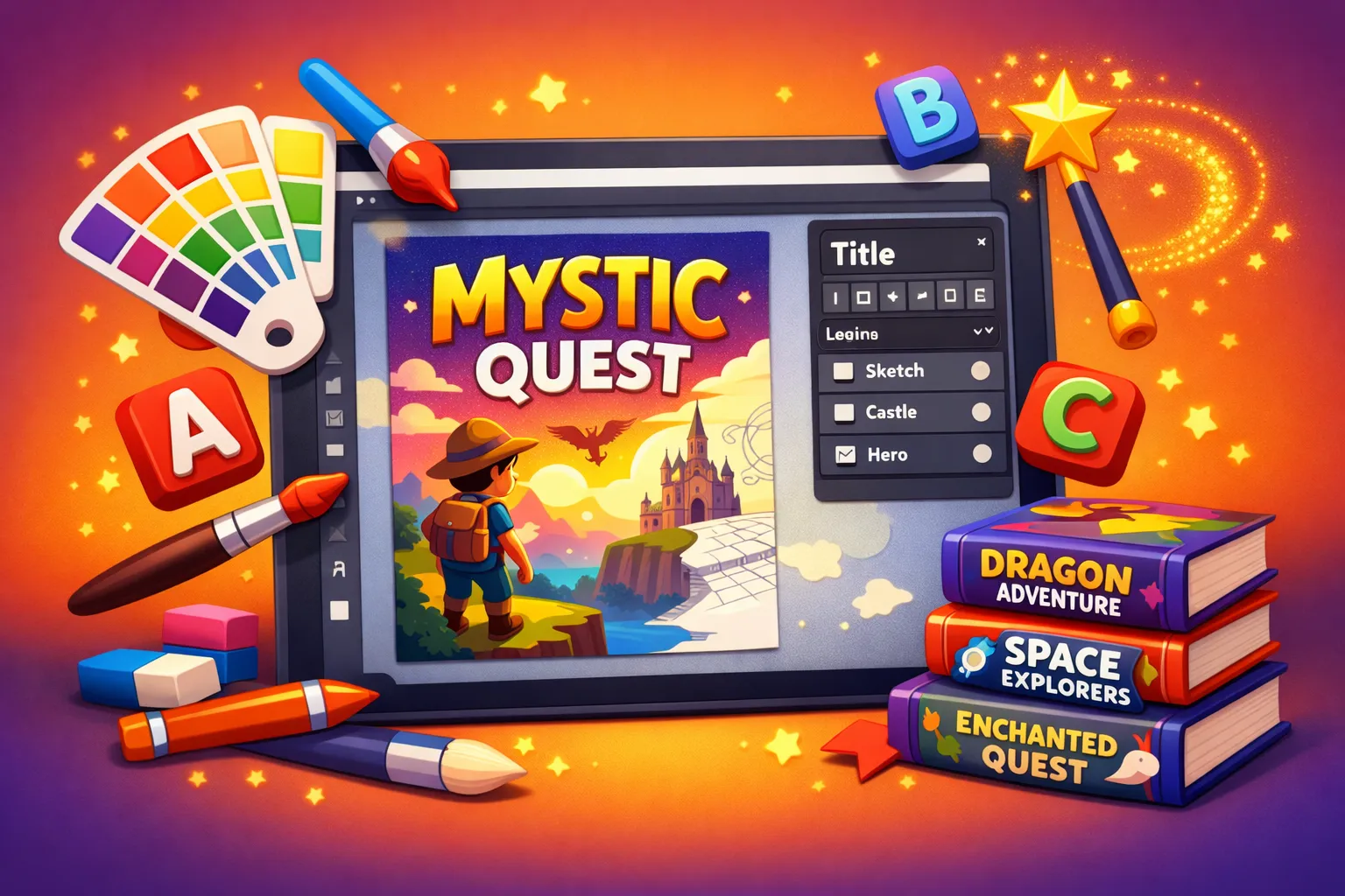
How Do You Generate an AI Book Cover Image?
Now you are ready to create. Inkfluence AI's cover designer includes AI image generation built directly into the cover creation workflow. You describe what you want, and the AI book cover maker generates a cover-ready background image in the correct dimensions. For the bigger picture of where cover design fits, see our piece on AI integration across publishing workflows.
Here is how to write an effective prompt for your cover background:
Be Specific About Subject and Mood
Vague prompts produce generic results. "A beautiful landscape" gives you something that could be on any book. "A misty mountain trail at dawn with golden light breaking through pine trees, atmosphere of solitude and discovery" gives you something that belongs on a memoir about hiking through grief.
Include emotional tone in your prompt. The mood of the image should match the mood of your book. "Dark," "ominous," "claustrophobic" for a thriller. "Warm," "hopeful," "sunlit" for a personal growth book. "Cozy," "whimsical," "inviting" for a children's book or cozy mystery.
Specify Art Style
Add the artistic style you identified during genre research. "Digital oil painting style," "cinematic photography," "flat vector illustration," "watercolor with visible brushstrokes," "minimalist line art." This single detail dramatically changes the output and ensures your cover matches genre expectations.
Leave Space for Text
This is the most common mistake with AI-generated cover images. The image looks stunning, but there is no clean area for your title. Add to your prompt: "leave clear space in the upper third for text" or "subject positioned in the lower half, upper area is simple sky/background." Planning text placement into the image generation step saves you from cropping or darkening a beautiful image later.
Generate Multiple Options
Generate at least 3-4 variations before choosing. AI outputs vary significantly between generations, even with the same prompt. Your first result might be good, but the fourth might be perfect. With Inkfluence AI, generation is included in your plan, so iterating costs nothing extra.
For a comparison of standalone AI image tools for covers, see our roundup of the best AI ebook cover generators in 2026.
Design your cover now
AI image generation, typography, and KDP export in one tool. Included free with every book project.
Open the Cover DesignerHow Do You Add Title and Typography to an AI Book Cover?
Typography makes or breaks a book cover. You can have a stunning background image and ruin it with the wrong font, bad sizing, or poor placement. Here is how to get it right.
Font Selection
Stick to 1-2 fonts maximum. Using three or more fonts makes a cover look amateur and cluttered. The standard approach is one font for the title and a different (or same) font for the author name and subtitle.
Match your font to genre expectations (from your Step 1 research). Quick guide:
- Serif fonts (Garamond, Playfair Display, Cormorant) - Literary fiction, historical, memoir, classic feel
- Sans-serif fonts (Montserrat, Inter, Raleway) - Modern non-fiction, tech, business, self-help
- Script/handwritten fonts (Great Vibes, Dancing Script) - Romance, lifestyle, journals, devotionals
- Bold condensed fonts (Oswald, Anton, Bebas Neue) - Thriller, action, true crime, sports
- Rounded/playful fonts (Nunito, Quicksand) - Children's books, cozy genres, humor
Size and Hierarchy
Your title should be readable as a thumbnail. On Amazon, most shoppers see your cover at roughly 150x200 pixels. If your title disappears at that size, it is too small or too thin. Test this by zooming out on your design until the cover is thumbnail-sized. Can you still read everything?
The visual hierarchy should be: Title (largest, most prominent) > Author name (second) > Subtitle if any (smallest). Use font weight and size to create this hierarchy, not competing colors or styles.
Contrast and Readability
White text on a light image is invisible. Dark text on a dark image is invisible. This sounds obvious, but it is the most common typography error on self-published covers. Ensure strong contrast between your text and the background behind it.
If your background image has mixed light and dark areas, add a semi-transparent overlay (dark gradient at the top, light gradient at the bottom, or a subtle color wash) to create a consistent background for text. Many cover designers, including Inkfluence AI's cover editor, include overlay tools for exactly this purpose.
How to Refine Colors and Layout
With your image and text in place, refine the overall composition. Step back and evaluate the cover as a whole, not as individual elements.
Color Harmony
Your title color should complement the dominant colors in your background image, not compete with them. Pull a color from the image itself for your text - this creates automatic visual harmony. For example, if your cover features a sunset with warm oranges, using a deep orange or gold for the title ties everything together.
Avoid using more than 3 colors in your text elements. Title in one color, author name in another (or the same), subtitle in a third. More than that looks chaotic on a small cover.
Whitespace and Breathing Room
New designers fill every pixel. Experienced designers embrace empty space. Give your title room to breathe. Keep margins generous. Do not push text to the edges. A cover with ample whitespace around the title looks more professional than one crammed with elements.
Test at Multiple Sizes
View your cover at three sizes: full resolution (for print), medium (for web product pages), and thumbnail (for search results and category listings). The cover needs to work at all three. A design that looks gorgeous at full size but becomes an unreadable blur as a thumbnail will not sell books.
What Are the Export Specs for Amazon KDP and Other Platforms?
Different platforms have different requirements. Getting this wrong means your cover gets rejected or displays poorly.
Amazon KDP Specifications
- Ebook cover: 2,560 x 1,600 pixels (1.6:1 ratio), JPEG or TIFF, RGB color space, minimum 72 DPI
- Paperback cover: Depends on trim size and page count (spine width varies). KDP provides a cover calculator. Minimum 300 DPI for print.
- File size: Under 50 MB
Other Platforms
- Apple Books: 1,400 x 1,873 pixels minimum (3:4 ratio), JPEG or PNG
- Kobo: 1,600 x 2,400 pixels recommended, JPEG
- IngramSpark: 300 DPI minimum, PDF with bleed for print
- Gumroad/direct sales: 1,600 x 2,400 pixels, any web-friendly format
Inkfluence AI exports covers at KDP-ready resolution by default. The Kindle publishing tools guide covers the full upload process if this is your first time publishing on Amazon.
For print books, consider using KDP's cover creator for the back cover and spine, then inserting your AI-designed front cover. The spine width depends on your page count and paper type, and KDP's tool calculates this automatically. See our complete KDP self-publishing guide for the full process.
7 Common Book Cover Design Mistakes to Avoid
Key Takeaways
- Total time: You can design a professional AI book cover in 10-15 minutes using an integrated tool like Inkfluence AI.
- Step 1 - Genre research: Study top 20 bestselling covers in your category to learn the visual language readers expect.
- Step 2 - Choose a style: Photographic (romance, thriller), illustrated (fantasy, children's), or typography-focused (business, self-help).
- Step 3 - Generate: Write specific AI prompts including mood, art style, and text placement. Iterate at least 3-4 times.
- Step 4 - Typography: Stick to 1-2 fonts. Title must be readable at thumbnail size (150px wide).
- Step 5 - Export: Amazon KDP requires 2,560 x 1,600 pixels for ebook covers. Print needs 300 DPI minimum.
- Cost: AI cover design is free with Inkfluence AI vs $200-$1,500 for a professional designer.
After reviewing thousands of self-published covers, these are the errors that appear most often:
1. Too many elements. A person, a building, a dog, a sunset, mountains, and a floating candle. Pick one focal point and let it dominate. Busy covers look chaotic at thumbnail size and fail to communicate what the book is about.
2. Tiny text. If the title is not legible at thumbnail size, it needs to be bigger. Period. Many self-published authors use beautiful but thin fonts that vanish on Amazon. Bold, large, high-contrast text works at every size.
3. Ignoring genre conventions. Your thriller cover with pastel watercolors will be beautiful and sell zero copies. Readers use visual cues to identify genre before reading a single word. Break convention deliberately (rare) or follow it (almost always).
4. Low-resolution images. A blurry cover screams "amateur." Always use the highest resolution available from your AI generator. If the output looks soft, generate again at a larger size or use an AI upscaler before building your cover.
5. Competing with the image. The background image and the text should work together, not fight for attention. If your image is very detailed, your text needs to be very simple (and placed on a clear area). If your text is complex (long title, subtitle, series name), your image needs to be simple.
6. Amateur font choices. Comic Sans, Papyrus, and most decorative fonts that come pre-installed on your computer will make your cover look self-published in the worst way. Use professional typefaces from Google Fonts or the fonts included in your cover design tool.
7. Skipping the thumbnail test. Every design decision should be validated at thumbnail size. Shrink your cover to 150 pixels wide. If it still communicates the genre, mood, and title clearly, you have a good cover. If it becomes an unrecognizable smudge, start over.
Avoid all 7 mistakes automatically
The cover designer includes genre-appropriate templates, KDP-resolution export, and a thumbnail preview so you can test before publishing.
Start Designing Your CoverCover Design Tips by Genre
Romance
Warm tones, attractive characters (or suggestive silhouettes), script fonts for the title. Sub-genre matters enormously: contemporary romance uses photography, fantasy romance uses illustration, dark romance uses desaturated/moody imagery. Always include a clear sub-genre signal. Readers browsing romance know exactly what they want, and the cover tells them whether your book is it. Check our romance writing guide for genre-specific advice.
Thriller and Mystery
Dark backgrounds, high contrast, bold sans-serif or condensed fonts. Red and yellow as accent colors signal danger and urgency. Imagery should be unsettling or mysterious: a lone figure, a dark corridor, a crime scene element. Avoid showing faces clearly - silhouettes and partial views create more tension. See writing tips at AI Mystery and Thriller Writer.
Self-Help and Personal Development
Clean, bright, optimistic. Typography-forward with a bold title and minimal imagery. Blues, greens, and whites convey trust and growth. Avoid cluttered imagery - a simple icon or abstract shape is more effective than a busy photograph. The title should promise a specific transformation. Visit our self-help book writer for the genre.
Children's Books
Bright, saturated colors. Character-focused illustration with expressive faces. Rounded, playful fonts. The cover should tell a micro-story - what is the character doing? Where are they? The illustration style should match the interior art (if any). Parents judge a children's book by how appealing the cover looks to their child. Write yours with our children's book creator.
Business and Non-Fiction
Authority and clarity. Large, bold title. Often a single dominant color. Minimal or no imagery. Subtitles are common and should be readable. Author credentials (if impressive) can appear on the cover: "New York Times Bestselling Author" or "CEO of X Company." The cover should look like it belongs on a conference table. For business content, try our business book writer.
Cookbooks and Food
High-quality food photography (or realistic AI food imagery) is essential. Warm lighting, natural styling, visible texture. The food should look appetizing - this sounds obvious but AI-generated food can sometimes look slightly off. Bold, clean typography that does not compete with the food image. See our cookbook generator.
Frequently Asked Questions
Can I use AI-generated images for my book cover legally?
Yes. Images generated by AI tools are usable for commercial purposes including book covers. Most platforms (including Amazon KDP) do not prohibit AI-generated cover art. However, copyright status of AI images varies by jurisdiction, so they cannot be formally registered for copyright protection in most cases. For practical publishing purposes, this rarely matters.
What is the best AI tool for book cover design?
Inkfluence AI is the best integrated option because it combines AI image generation, typography tools, and KDP-ready export in one editor. For standalone AI image generation, Midjourney produces the highest quality artistic images, while DALL-E 3 is best for photorealistic covers. See our full cover generator comparison.
How much does an AI book cover cost?
With Inkfluence AI, cover design is included free with every book project. Standalone AI image generators range from free (limited outputs) to $10-$30/month for unlimited generation. Compare this to $200-$1,500 for a professional designer and $50-$300 for premium pre-made covers.
What resolution should my book cover be?
For Amazon KDP ebooks: 2,560 x 1,600 pixels minimum (1.6:1 ratio). For print: 300 DPI minimum at your trim size plus bleed. For Apple Books: 1,400 x 1,873 pixels minimum. Always export at the highest resolution your tool supports and downsize for other platforms if needed.
Can I design a print book cover (paperback) with AI?
AI tools can generate the front cover image and typography. For a complete paperback cover (front, spine, back), you will need to use KDP's cover calculator to determine spine width based on page count, then assemble the full wrap cover. Inkfluence AI exports the front cover at print-quality resolution. For the full wrap, many authors use Canva or KDP's built-in cover creator for the spine and back, inserting their AI-designed front panel.
Does Amazon reject AI-generated covers?
Amazon KDP does not reject covers for being AI-generated. Covers are rejected for not meeting technical specifications (wrong dimensions, low resolution, incorrect color space) or for violating content policies (misleading imagery, trademarked elements). As long as your AI cover meets the specs and does not infringe on trademarks, it will pass review.
How do I make my title readable on the cover?
Use a bold or semi-bold font weight. Ensure strong contrast between text and background (white text on dark areas, dark text on light areas). Test at thumbnail size (150 pixels wide). If the title is unreadable at thumbnail size, increase the font size, switch to a bolder font, or add a semi-transparent overlay behind the text for contrast.
Should I hire a designer or use AI?
For most self-published authors, AI cover design produces professional results at a fraction of the cost. Hire a designer if: you are publishing a high-budget project where every detail matters, your genre has extremely specific visual conventions you are not confident replicating, or you want a completely unique hand-illustrated cover. For everything else, AI tools in 2026 produce covers that compete with professional designs.
Related Reading

Founder, Inkfluence AI
Sam is the founder of Inkfluence AI. He built the platform to make book creation accessible to everyone - from first-time authors to seasoned publishers.
Helpful links
Ready to Create Your Own Ebook?
Start writing with AI-powered tools, professional templates, and multi-format export.
Get Started FreeRelated Articles
 AI Writing
 Nearly 9 in 10 AI Books Are Exported as PDF: Here Is Why (2026 Data)
We looked at 20,010 export choices across AI-generated books. PDF won almost 9 out of 10 times, far ahead of DOCX and EPUB combined. Here is the data and what it says about how people actually use the books they create with AI.
 AI Writing
 We Analyzed 47,424 AI-Generated Books: What People Actually Create in 2026
A first-party look at 47,424 books written with AI. Practical guides lead, fiction is the single biggest genre, romance is the breakout, one in six books is not in English, and PDF dominates exports. Here is what people really make with AI.
 Self-Publishing
 How to Publish a Poetry Book on Kindle in 2026: The Complete Indie Poet Guide
Poetry collections sell well on KDP when they are formatted properly. Most indie poets get tripped up on the same five things: stanza spacing collapses on reflow, long lines break unintentionally, the cover does not signal poetry, the description reads like fiction back-cover copy, and the categories miss the readers. Here is the complete workflow.
Get ebook tips in your inbox
Join creators getting weekly strategies for writing, marketing, and selling ebooks.