
Read the first chapter
The whole of chapter one, free. About 10 min. Turn the pages with the arrows, your keyboard, or a swipe.
Chapter 1
Brand Positioning Map
A brand that can’t clearly explain “who it’s for” and “why it’s different” loses money twice: once in marketing spend that attracts the wrong people, and again when the right people still don’t feel compelled to buy. In B2B, this shows up fast - one common pattern is that teams with fuzzy positioning see higher churn because prospects don’t fully understand what they’re getting until after purchase. Nia, 34, a B2B software-as-a-service (SaaS) marketer, felt that exact drag. Her website looked polished, her content was steady, and yet demo requests plateaued. Sales feedback came back consistent: prospects loved parts of the product, but they weren’t sure it was built for their specific situation - and competitors kept winning on clarity.
This chapter is for marketers and content creators who are tired of guessing which message will land. You might already have a product description and a logo, but you don’t have a positioning map that tells you what to say (and what to stop saying) across your site, email, and visuals. By the end, you’ll build a “Positioning Compass Map” that defines your category, your audience, and your differentiators - then you’ll use it as a decision tool so every future post, landing page, and creative direction stays consistent.
The Strategy: Build a Positioning Compass Map that locks your category, audience, and differentiators
The Positioning Compass Map is a simple positioning tool that forces three answers into one view: your category (where people “file” you), your audience (who you’re actually trying to reach), and your differentiators (what makes you the obvious choice in that category for that audience). The goal isn’t to sound clever. The goal is to make your messaging feel inevitable, like the only reasonable option.
Use this strategy when you notice one of these situations: demo requests stall even though traffic is healthy; sales keeps hearing “we weren’t sure you solved our problem”; your content performs but doesn’t convert; or your visuals and copy feel like they belong to different brands depending on the channel. If you’re already getting qualified leads, use it anyway - positioning drift is common when new features, new hires, or new campaigns start pulling your message in different directions.
To execute successfully, you need four things, and you should assign ownership before you start: - A message owner (usually marketing lead) who will confirm the final category and audience choices and own the map. - A sales partner (one active sales rep or sales manager) who will supply the real objections and buying triggers you must address. - A product partner (product manager or founder) who will confirm what’s true about the product and what’s not. - A data owner (could be the same as message owner) who will pull numbers from your analytics and track changes during testing.
You also need the raw material, gathered in a short sprint: - Your top five customer wins from the last 90 days, including the reason they chose you (use call notes, CRM notes, or recorded demos). - Your top five lost deals from the same window, including the reason you lost (even if it stings). - Your top five “most visited” pages or content pieces from the last 60 days (so we can see what people are already reacting to). - Your existing brand assets: homepage, one product page, one pricing or plan page, and your most-used social template.
For Nia, the turning point wasn’t rewriting copy. It was narrowing the compass. Her team realized they kept calling the product an “automation platform,” but buyers didn’t search for automation - they searched for risk reduction, compliance readiness, and faster reporting. When they reframed the category and audience around those buying goals, messaging became easier: the same features suddenly sounded relevant instead of generic.
Execution Steps: Create your map, validate it, and wire it into decisions
You’ll build the Positioning Compass Map in one focused working session, then validate it with quick tests. This is not a “big reveal deck.” It’s a practical map you’ll use every week to choose what you publish and what you change.
1. Define your category in plain language (Checkpoint: category clarity score) - Action: Write three candidate category statements you could put under your logo. Keep them short - no more than 8 words each. Examples for Nia’s team might look like: “Risk-ready reporting for B2B teams” or “Compliance-ready analytics that teams trust.” - Action: Run an internal clarity check: ask five people who are not on the project (a marketer from another team, a designer, a sales rep who wasn’t in the room, a customer success manager, and one friend who buys SaaS occasionally) to read each statement and answer: “What do you think this product does?” Score each statement by how many answers match your intended category. - Metric: Category Clarity Score = percent of testers whose description matches your category statement. - Target: At least 80% match for the top category option. - Time estimate: 45-60 minutes to draft, 30 minutes to test.
2. Pick your audience by “buying job,” not by industry (Checkpoint: audience match rate) - Action: List 5-7 audience groups you’ve been targeting or attracting. Then rewrite each group as a buying job: “teams that need X so they can Y.” For B2B SaaS, “industry” alone rarely explains purchase behavior. - Action: Use sales notes to extract the top three triggers that cause a buyer to act now (for example: audit deadlines, leadership reporting demands, a recent incident, or a contract renewal). - Metric: Audience Match Rate = percent of sales notes that mention the selected buying job or triggers when describing why they bought. - Target: Your chosen audience should show up in at least 60% of the last 10 wins. - Time estimate: 60 minutes to extract triggers and align wording.
3. Identify your differentiators as “proof points,” not claims (Checkpoint: proof strength score) - Action: For each differentiator you’re considering, add one proof point. Proof points must be observable: a measurable outcome, a customer quote, a feature that’s uniquely implemented, a workflow that’s faster, or a compliance result you can show. - Action: Create a table with three columns for Nia’s team: Differentiator, Proof Point, and “Where it appears” (homepage, product page, case study, demo slide). - Metric: Proof Strength Score = count of differentiators that have a specific proof point (not “we’re the best,” not “we innovate”). - Target: Minimum 3 differentiators with proof points, maximum 5. If you have fewer than 3, you’re likely underselling. If you have more than 5, you’ll dilute the message. - Time estimate: 60-90 minutes, depending on how organized your customer proof is.
4. Map the positioning compass and lock the “do not confuse” boundaries (Checkpoint: confusion reduction in copy tests) - Action: Draw your compass with four labels: Category (where you fit), Audience (who buys), Differentiators (why you win), and Boundaries (what you are not). The boundaries matter because they prevent accidental targeting. - Action: Write two “do not confuse” statements, each in one sentence: - “We’re not for buyers who want [wrong outcome].” - “We’re not built for [wrong team workflow].” - Action: Run a copy test with 10 people from your target pool (or a close stand-in if you can’t recruit enough). Show them your current homepage headline and your proposed positioning compass summary (category + audience + top 2 differentiators). Ask: “Who do you think this is for?” and “What problem does it solve?” - Metric: Confusion Rate = percent who answer with the wrong audience/job or wrong problem. - Target: Reduce confusion by 30% versus current messaging. - Time estimate: 2 hours to build the map and craft the summary, 60 minutes for the test.
5. Wire the compass into your content and visuals using a simple decision rule (Checkpoint: conversion lift on one page) - Action: Pick one asset to update first (for Nia, it was the homepage hero section and one product page). Use the compass as the rule: every headline must name the buying job (audience), every subhead must reinforce the category, and every feature callout must connect to a proof point (differentiator). - Action: Add one “proof module” above the fold (customer quote, metric, or screenshot with a caption). Keep it relevant to the top differentiator. - Action: Run a short test for 14 days. - Metric: Primary Conversion Rate = percent of visitors to the updated page who request a demo or start a trial. - Target: 15% relative lift on the primary conversion rate (for example, from 4.0% to 4.6%). - Secondary Metric: Demo-to-qualified rate = percent of demo requests that sales marks as qualified. - Target: Maintain or improve qualified rate; if qualified rate drops, your messaging is attracting the wrong people. - Time estimate: 1-2 days to implement changes, 14 days to run test, 30 minutes to review results.
If you’re wondering where people usually get stuck: it’s step 3. Teams list differentiators as features (“we have X integration”) instead of proof (“this reduces time-to-report by 40%”). When Nia’s team replaced “integration-first” with a proof-backed statement - “reporting in hours, not weeks” - the same screenshots and UI visuals suddenly supported the story instead of competing with it.
Watch Outs: Anti-patterns that break positioning maps (and how to avoid them)
Don’t pick a category you can’t prove because you’ll sound like everyone else and your copy tests will show high confusion. If your category statement can’t be supported by what you show on your site, your audience will sense the gap.
Don’t define your audience as “everyone in our industry” because the buying job will be too broad. Your map needs a specific job-to-be-done, plus buying triggers from real sales calls. If you can’t point to triggers, you’re guessing.
Don’t list differentiators as vague promises (“best,” “fastest,” “most secure”) because proof will always be missing. Replace each promise with a proof point you can point to: a customer outcome, a measurable workflow improvement, or a specific feature that produces a specific result.
Don’t let sales objections live in a spreadsheet while your website says something else because prospects will feel the mismatch during purchase. Your map should include the boundaries (“do not confuse”) that directly address common wrong-fit objections.
Don’t update only copy while keeping visuals and layout unchanged because your visuals will still imply a different category. For example, if you reposition from “automation platform” to “risk-ready reporting,” you should shift visual emphasis toward reporting outputs, dashboards, and proof modules - not generic workflow icons.
Don’t expand the map when it feels “almost right” because you’ll dilute the message. The Positioning Compass Map should guide decisions, not become a dumping ground. Keep differentiators between 3 and 5 with proof points.
Success Metrics: Know whether the positioning map is working
You’ll measure success in two layers: message clarity (do people understand you?) and business results (does it convert the right people?). Tie both to the same assets so you can see cause and effect.
Start with message clarity checks, because they happen before conversions. Run a copy test after you build the map and again after your first page updates. Use the same questions every time so you can compare results: - Category match: percent who identify the intended category from your headline and summary. - Target: 80% match or higher. - Audience/job match: percent who name the correct buying job (not just the industry). - Target: 70% match or higher. - Confusion rate: percent who pick the wrong problem or wrong audience. - Target: 30% reduction versus your current messaging.
Then track conversion outcomes on the first asset you update (homepage hero + one product page is a common starting point for B2B SaaS). Keep the test short enough that you can act on it, but long enough to collect real behavior: - Primary Conversion Rate (demo request or trial start) over 14 days. - Target: 15% relative lift. - Qualified Rate (demo-to-qualified, or lead-to-qualified if you don’t do demos). - Target: Don’t let this drop more than 5%. If qualified rate drops, your positioning is too broad or your boundaries are weak. - Sales cycle quality signal: percent of demos that reach the next step (for example: proposal, security review, or implementation call). - Target: 10% lift in “next step rate” within one sales cycle.
For Nia, the proof that the map worked wasn’t a temporary spike. It was consistency: over the next two content cycles, her team stopped writing “feature explainers” that didn’t connect to the buying job. The new posts referenced the same proof points and used the same category language. After 30 days, the sales team reported fewer “we weren’t sure what you do” calls and more “this matches our reporting deadline” conversations. That’s what a positioning map is meant to create: less back-and-forth, more fit.
If you want one final checkpoint before you move on to the next step in your branding work, look at your internal consistency. Can someone on your team explain your category, audience, and top differentiators in under 20 seconds without reaching for buzzwords? If they can, the compass is doing its job - and your future messages will stop wandering.
End of chapter one. 6 more chapters in the full book.
Swipe or use the arrows to turn the page


What's inside: 7 chapters
- 1. Brand Positioning Map
- 2. Audience Messaging Matrix
- 3. Brand Voice and Tone System
- 4. Visual Identity Starter Kit
- 5. Content Pillars and Editorial Rhythm
- 6. Launch Messaging and Campaign Kit
- 7. Brand Consistency Audit Workflow
About this book
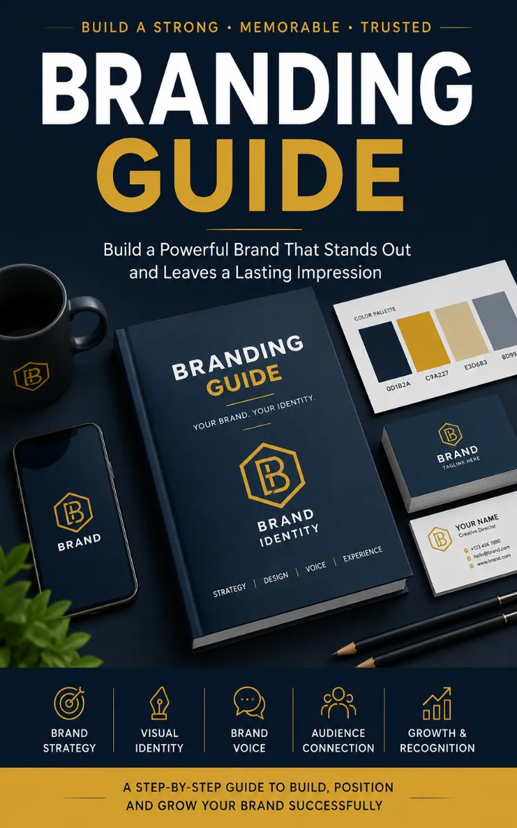
"Branding Guide" is a marketing book by Subir Bhattacharjee with 7 chapters and approximately 17,034 words. Brand identity strategy, positioning, messaging, and visual guidelines.
This book was created using Inkfluence AI, an AI-powered book generation platform that helps authors write, design, and publish complete books. It was made with the AI Ebook Creator.
Frequently Asked Questions
What is "Branding Guide" about?
Brand identity strategy, positioning, messaging, and visual guidelines
How many chapters are in "Branding Guide"?
The book contains 7 chapters and approximately 17,034 words. Topics covered include Brand Positioning Map, Audience Messaging Matrix, Brand Voice and Tone System, Visual Identity Starter Kit, and more.
Who wrote "Branding Guide"?
This book was written by Subir Bhattacharjee and created using Inkfluence AI, an AI book generation platform that helps authors write, design, and publish books.
How can I create a similar marketing book?
You can create your own marketing book using Inkfluence AI. Describe your idea, choose your style, and the AI writes the full book for you. It's free to start.
Write your own marketing book with AI
Describe your idea and Inkfluence writes the whole thing. Free to start.
Start writingCreated with Inkfluence AI


