
Read the first chapter
The whole of chapter one, free. About 7 min. Turn the pages with the arrows, your keyboard, or a swipe.
Chapter 1
The Non-Designer Mind Reset
The Cost of Treating Design Like Talent
A gym owner opens a design app to make a weekend offer. Forty minutes later, the graphic has five fonts, three bright colors, a stretched logo, and a discount buried near the bottom. The offer itself is good. The design makes people work to understand it.
That problem does not come from a lack of artistic talent. It comes from making visual decisions without a clear order. When every element competes for attention, the viewer has to solve the graphic before deciding whether to act. Most viewers will simply keep scrolling.
Design clarity fixes that problem. You do not need to draw, illustrate, or master complex software. You need a repeatable way to decide what matters first, what supports it, and what you can remove. The Clarity Ladder Model gives you that order: message first, action second, proof third, style last.
After using it, you will be able to build a clean promotional post, flyer, slide, or lead magnet without waiting for inspiration. You will also know why the design works, which means you can fix weak marketing faster instead of randomly changing colors and fonts.
Your practical takeaway: stop asking, “Does this look designed?” Ask, “Can the right person understand this in three seconds?”
The Clarity Ladder Model
The Clarity Ladder Model turns design from a talent test into a decision sequence. Each rung answers one question before you move to the next. If a lower rung fails, a higher rung cannot rescue it. A glowing accent color will not fix a confusing offer. A stylish font will not fix a missing call to action.
Use the ladder in this order:
• Message - What must the viewer understand first?
Write one short sentence that states the offer or point. For a plumbing business, use “Same-day water heater repair,” not “Complete residential plumbing solutions.” The first version gives the viewer a clear problem and service.
• Action - What should the viewer do next?
Choose one action: call, book, download, visit, or reply. Write it as a direct instruction, such as “Book a repair today.” One action reduces hesitation because the viewer does not need to choose between competing paths.
• Proof - Why should the viewer believe you?
Add one useful reason to trust the offer: “Licensed technicians,” “Free first class,” or “Available this Saturday.” Keep proof short. A wall of claims hides the main message.
• Style - How should the design feel?
Choose the background, type, color accent, image treatment, and spacing only after the first three rungs work. Style should strengthen the message, not compete with it.
This order matters because viewers scan before they read. Make the main message the largest text. Make the action easy to find. Keep proof close enough to support the offer without stealing attention. Then use style to create a recognizable look.
A simple visual setup works for most beginner projects: one dark background, one light text color, one accent color, and two typefaces at most. Use a bold sans-serif font for the headline and a plain sans-serif font for details. A dark navy background, white text, and one electric green button can look deliberate. Dark navy, red, orange, purple, yellow, and blue in the same graphic usually looks accidental.
Whitespace means the empty space around text and objects. Treat it as working space, not wasted space. If your headline touches the edge of a 1080-by-1080-pixel social post, move it inward until it has room to breathe. If three lines of small copy sit under the headline, remove or shorten them before shrinking the font. Small text does not create clarity; it hides the problem.
Ask yourself three questions before opening your design tool: What should someone remember? What should they do? What can I remove? Your answers create the layout before you touch a template.
Ladder rung
Beginner decision
Example
Message
State the main benefit
“Build strength in 30 days”
Action
Choose one next step
“Claim a trial session”
Proof
Add one trust signal
“Small-group coaching”
Style
Set the visual system
Dark background, white type, neon green accent
The practical takeaway: build the information in ladder order, then make it attractive. That single change prevents most beginner designs from becoming crowded.
A Real Offer Built with the Ladder
Consider a local fitness studio promoting a Saturday beginner class. The studio wants new members, but its first draft says “Saturday Fitness Experience” in thin white text over a busy workout photo. The price appears in the corner, and the booking link sits in tiny type at the bottom. The design looks active but does not make the offer easy to understand.
Apply the Clarity Ladder Model like this:
• Write the message in one line.
Replace the vague title with “Beginner Strength Class - Saturday at 10 AM.” This tells the viewer what happens, who it suits, and when it happens. Expected outcome: the viewer understands the offer without reading supporting text.
• Choose one action.
Add a high-contrast button that says “Reserve your spot.” Remove “Learn more,” “Message us,” and “Visit our website” from the main graphic. Expected outcome: the viewer sees one clear route to booking.
• Add one proof point.
Place “Coach-led • No experience needed” below the headline. Do not add a paragraph about the studio’s history. Expected outcome: beginners feel less uncertain without losing focus.
• Build the visual frame.
Use a 1080-by-1350-pixel portrait layout for a feed post. Set the background to near-black, the headline in white, and the booking button in neon green. Keep the photo inside a narrow rectangular frame on the right side instead of using it as a full-background image. Expected outcome: the words remain readable while the photo adds energy.
• Check the three-second read.
Shrink the design until it appears about the size of a phone preview. Read only the largest text and button. If you cannot identify the class, time, and action immediately, revise the hierarchy. Expected outcome: the graphic works during a fast scroll, not only at full size.
• Remove one element.
Delete the studio slogan from the bottom. It does not help someone book this class. Expected outcome: more space around the important information and less visual competition.
The finished layout needs no decoration beyond the offer, action, proof, and controlled style. A viewer should see “Beginner Strength Class,” notice “Saturday at 10 AM,” and find “Reserve your spot” without searching.
Quick checklist
• Write one main message before opening the design tool.
• Use one action, not several competing instructions.
• Add one proof point that reduces doubt.
• Limit the design to two typefaces.
• Use one accent color for the action or key detail.
• Keep text away from the edges.
• Preview the graphic at phone size.
• Remove any element that does not support the message or action.
• Check that the booking method appears clearly.
If the design passes this check, publish it. Do not keep adjusting it because the software offers more effects. More options create more chances to weaken the message.
Mistakes That Break Clarity
Mistaking decoration for design
Beginners often add shadows, outlines, stickers, gradients, and extra icons because the empty space feels unfinished. Those additions create noise when the message already lacks structure.
Do this: Use decoration only when it improves reading order or supports the offer. Add one thin frame, one accent shape, or one image treatment with a clear job.
Not this: Add effects until the background, headline, button, and logo all demand attention.
A useful test: hide each decorative element one at a time. If removing it changes neither meaning nor action, leave it out.
Writing the whole sales pitch on the graphic
A marketing graphic cannot carry every detail. When you squeeze the full explanation onto the canvas, the headline shrinks and the viewer skips the entire thing.
Do this: Put the strongest benefit on the graphic and move details to the caption, landing page, or booking conversation. For example, use “Free 20-minute tax review” on the image and explain eligibility elsewhere.
Not this: Use six lines about process, qualifications, terms, location, and background before showing the offer.
Keep the main message under roughly ten words when possible. This limit forces a useful decision: what does the viewer need first?
Changing the design every time
A different font, color, and layout for every post makes a business harder to recognize. It also slows production because you start from zero each time.
Do this: Save a small visual system: one dark background color, one light text color, one accent color, one headline font, one body font, and three reusable layouts.
Not this: Choose colors from scratch for every promotion or copy a new trend from another account.
Consistency does not mean every post looks identical. Keep the visual ingredients stable while changing the message and image. That gives you speed without making the marketing feel careless.
Using style to hide an unclear offer
A polished layout can still fail if the viewer cannot tell what you sell, who it helps, or what to do next. Good-looking confusion remains confusion.
Do this: Return to the ladder. Rewrite the message, select one action, and add one proof point before touching the visual style.
Not this: Change the background, add a new image, or search for another template when the offer itself needs clearer words.
Design clarity starts before the design tool. Write the decision in plain language, place each piece in order, and remove anything that makes the viewer pause for the wrong reason. When you treat design as a logic system, you stop waiting to feel creative and start shipping marketing that people can understand.
End of chapter one. 4 more chapters in the full book.
Swipe or use the arrows to turn the page
What's inside: 5 chapters
- 1. The Non-Designer Mind Reset
- 2. Hierarchy That Guides the Eye
- 3. Typography and Contrast Rules
- 4. Color Discipline for Neon Accents
- 5. The Publish-Ready Design Checklist
About this book
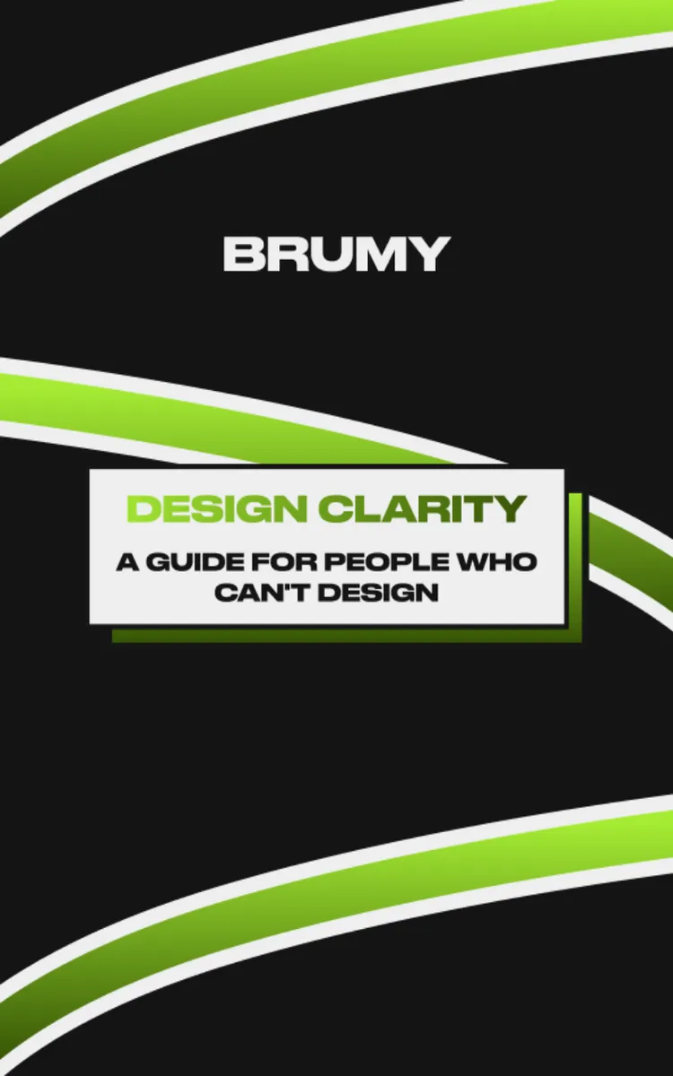
"Design Clarity" is a how-to guide book by Adrian Gramus with 5 chapters and approximately 8,641 words. Actionable design principles and execution frameworks for marketing assets.
This book was created using Inkfluence AI, an AI-powered book generation platform that helps authors write, design, and publish complete books. It was made with the AI Ebook Generator.
Frequently Asked Questions
What is "Design Clarity" about?
Actionable design principles and execution frameworks for marketing assets
How many chapters are in "Design Clarity"?
The book contains 5 chapters and approximately 8,641 words. Topics covered include The Non-Designer Mind Reset, Hierarchy That Guides the Eye, Typography and Contrast Rules, Color Discipline for Neon Accents, and more.
Who wrote "Design Clarity"?
This book was written by Adrian Gramus and created using Inkfluence AI, an AI book generation platform that helps authors write, design, and publish books.
How can I create a similar how-to guide book?
You can create your own how-to guide book using Inkfluence AI. Describe your idea, choose your style, and the AI writes the full book for you. It's free to start.
Write your own how-to guide book with AI
Describe your idea and Inkfluence writes the whole thing. Free to start.
Start writingCreated with Inkfluence AI


