
Read the first chapter
The whole of chapter one, free. About 6 min. Turn the pages with the arrows, your keyboard, or a swipe.
Chapter 1
Build a Premium Black-Chrome Cover
Turn a Dark Cover Into an Instant Value Signal
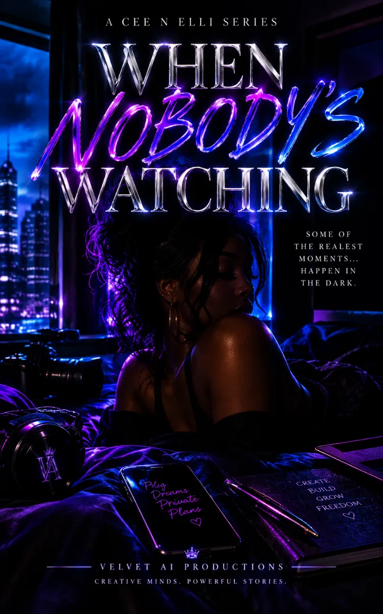
A product cover can look expensive and still feel empty. A black background, shiny title, and a few neon streaks won’t automatically make Velvet AI Productions - Creative Content Launch Kit feel worth buying. If the colors compete, the cover reads as decoration instead of a polished product.
The fix is the Velvet Contrast Method: use black to create desire, chrome to signal value, deep purple to add mystery, and electric blue to direct attention. You’ll leave with a one-page Velvet Contrast Scorecard you can use to judge your cover before publishing it.
The Fastest Way to Make the Cover Feel Premium
Start with this ratio:
| Design element | Suggested share | Job | |---|---:|---| | Black | 60-70% | Creates depth and luxury | | Chrome | 15-20% | Makes the product feel valuable | | Deep purple | 10-15% | Adds feminine mystery and atmosphere | | Electric blue | 5-10% | Pulls the eye toward the key message |
These percentages aren’t a prison. They’re a quick correction when the design starts feeling muddy or loud. If electric blue takes over half the cover, it stops feeling like a signal and starts feeling like a nightclub poster. If everything is black and chrome, the design may look sleek but forgettable.
For the title, use chrome as a controlled highlight rather than a full-page effect. A strong setup might place “Velvet AI Productions” in a polished silver-chrome finish, with “Creative Content Launch Kit” in soft white or pale lavender beneath it. Then use one electric-blue accent on a thin line, lens flare, or small production detail. That single blue note gives the eye somewhere to land.
Your immediate template is simple: dark field, metallic title, purple atmosphere, blue direction. Keep that sentence beside your AI design prompt or editing canvas. It stops you from adding one more glow, one more gradient, and one more “cool” effect until the cover has lost its shape.
The Velvet Contrast Method in Practice
The Velvet Contrast Method works because each color has a clear role. Black is not merely a background. It’s the space that lets the other details feel rare. Use a near-black shade such as #08080D instead of flat pure black when you want a little softness and depth.
Chrome should carry the product promise. A good chrome treatment needs contrast: bright silver highlights, darker graphite edges, and a restrained reflection. Flat gray text looks unfinished. White text with a faint metallic gradient can look polished, but only when the letters remain easy to read at thumbnail size.
Deep purple builds the mood. Try a rich tone near #24103F or #321052 and keep it mostly in the background. It works beautifully as a soft haze behind the title, a curved light bloom, or a shadowed gradient near the lower third. Purple should be felt before it’s noticed.
Electric blue is your attention tool. A shade near #168CFF can highlight a short phrase, a play-button detail, a rim light, or a narrow line beneath the title. It should feel intentional, almost like a tiny LED on expensive equipment.
A small production studio tested two cover directions for a digital launch kit. The first used equal amounts of black, purple, blue, and silver. It looked energetic, but the title disappeared into the effects. The second pushed black to roughly two-thirds of the composition, reduced purple to a soft glow, and kept blue to one accent line. The second version was easier to recognize in a small preview because contrast created hierarchy.
That’s the part many AI-generated covers miss. The image can be technically beautiful while still failing the three-second test: What is this? Who is it for? Why does it look worth opening?
Use this quick check:
• Black frames the product. - Chrome names the product. - Purple sets the emotional temperature. - Blue points to the promise.
For Velvet AI Productions, the promise might appear as a small chrome or blue line such as “Create. Launch. Look Premium.” Keep it short. A cover is not the place to explain every feature of the kit.
Typography matters just as much as color. Choose one elegant display font for the main title and one clean sans serif for supporting text. A high-contrast serif can add feminine luxury, while a geometric sans serif keeps the design modern. Avoid using three decorative fonts. Chrome already brings drama; the lettering doesn’t need to audition for a second role.
You can also add subtle film and production cues without turning the cover into a prop closet. A narrow film-strip edge, a soft camera-aperture shadow, a faint timeline mark, or a glossy play icon is enough. Keep these details low contrast. They should reward a closer look, not fight the title.
A Five-Minute Velvet Contrast Check
You don’t need Photoshop, a design subscription, or a fresh AI render to improve the first impression. Open the current cover on your phone or shrink it until it’s about the size of a social media thumbnail. Then run this five-minute check.
First, cover the title with your hand or crop the image so only the artwork shows. Does the composition still have a clear dark center, a purple mood, and one blue point of energy? If the whole image glows evenly, the cover needs stronger black space.
Next, reveal the title again and look away for three seconds. When you look back, your eyes should land on Velvet AI Productions first. If they hit a flare, a blue streak, or a decorative camera icon, reduce that element’s brightness or size.
Now check the chrome. Does it look metallic, or does it look like gray text? Add a bright edge and a darker inner gradient, then keep the reflection subtle. Chrome needs light and shadow to feel like a surface.
Use this scorecard:
| Question | Yes/No | |---|---| | Does black cover at least half the visual area? | | | Is the main title readable at thumbnail size? | | | Does chrome appear mainly on the product name? | | | Is purple creating atmosphere rather than filling every corner? | | | Is electric blue limited to one or two attention points? | | | Can you identify the product in three seconds? | |
If you answer “no” to two or more questions, don’t add more effects. Remove something first. Premium design often arrives through subtraction (the glamorous version of cleaning your room).
A useful AI prompt adjustment is: “Use a predominantly black composition with controlled chrome typography, soft deep-purple atmospheric lighting, and one restrained electric-blue accent. Preserve clear negative space around the title. Avoid excessive neon, clutter, and multiple competing light sources.”
That final sentence matters. AI tools tend to reward excess unless you give them boundaries.
Build the Cover in Three Time Windows
In the next 10 minutes, choose your four-color roles and write them directly into your design notes: black for the field, chrome for the title, deep purple for mood, electric blue for direction. Remove any extra accent colors. Then shrink the cover to thumbnail size and check whether the title still wins.
Within 24 hours, create two variations using the same layout. In version A, place the blue accent beneath the title. In version B, place it near a small play icon or production detail. Keep everything else consistent. Compare them at phone size, not on a large monitor. The stronger version is the one that makes the product name easier to find, not the one with the flashiest glow.
Within one week, turn the winning cover into a small launch set: a square social graphic, a vertical story version, and a wide banner. Keep the Velvet Contrast Method intact across all three. The crop may change, but the color hierarchy shouldn’t. A customer should recognize the kit before reading every word.
For the full Velvet Contrast Scorecard, reusable AI prompt templates, and matching promotional artwork layouts, grab the complete Velvet AI Productions launch resource. Your cover only gets one first impression. Make it dark, deliberate, and impossible to mistake for an unfinished draft.
End of chapter one. 4 more chapters in the full book.
Swipe or use the arrows to turn the page
What's inside: 5 chapters
- 1. Build a Premium Black-Chrome Cover
- 2. Make Cinematic Typography Read Clearly
- 3. Add Mystery Without Losing Clarity
- 4. Style Film Details as Luxury Accents
- 5. Turn the Cover Into a Launch Campaign
About this book
"Velvet AI Productions" is a lead magnet book by Nana baby with 5 chapters and approximately 7,558 words. Premium promotional artwork and cover design for an AI creative content launch kit.
This book was created using Inkfluence AI, an AI-powered book generation platform that helps authors write, design, and publish complete books. It was made with the AI Lead Magnet Generator.
Frequently Asked Questions
What is "Velvet AI Productions" about?
Premium promotional artwork and cover design for an AI creative content launch kit
How many chapters are in "Velvet AI Productions"?
The book contains 5 chapters and approximately 7,558 words. Topics covered include Build a Premium Black-Chrome Cover, Make Cinematic Typography Read Clearly, Add Mystery Without Losing Clarity, Style Film Details as Luxury Accents, and more.
Who wrote "Velvet AI Productions"?
This book was written by Nana baby and created using Inkfluence AI, an AI book generation platform that helps authors write, design, and publish books.
How can I create a similar lead magnet book?
You can create your own lead magnet book using Inkfluence AI. Describe your idea, choose your style, and the AI writes the full book for you. It's free to start.
Write your own lead magnet book with AI
Describe your idea and Inkfluence writes the whole thing. Free to start.
Start writingCreated with Inkfluence AI


