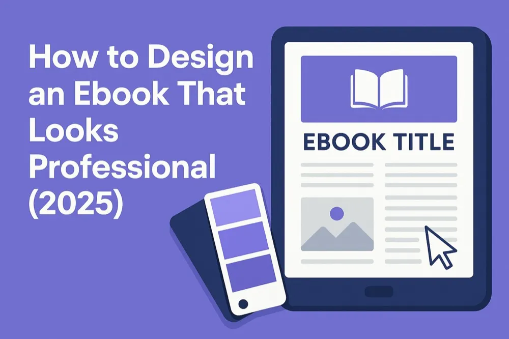
How to Design an Ebook That Looks Professional (2026 Edition)
A complete, modern guide to formatting, layout, typography, and visual polish - written for creators, coaches, agencies, and digital authors who want their ebooks to look credible and polished.
Quick Answer
Professional ebook design in 2026 comes down to visual trust: consistent typography, balanced spacing, unified margins, clean headings, and a coherent colour palette. Inkfluence AI applies these principles automatically when you generate and export your ebook - no design skills required. For manual design, focus on typography consistency, line spacing (1.4-1.6x), and a maximum of 2-3 fonts.
Designing a professional ebook in 2026 is no longer about simply dropping text into a PDF and hoping it looks acceptable. Readers today expect polish. They expect clean typography, balanced spacing, thoughtful layout, and a visual experience that feels deliberate. Even if your content is exceptional, the presentation determines how it's perceived. A poorly designed ebook feels amateur before the first paragraph is even read, while a well-designed one instantly communicates authority, credibility, and care.
Many creators assume ebook design is something you need years of design training to do well. Others fall into the trap of spending endless hours tweaking fonts or nudging boxes inside Canva, only to end up frustrated with inconsistent formatting. And for a lot of beginners, the biggest struggle is simply not knowing what "professional" actually looks like. Design feels subjective, so they keep adjusting and adjusting, hoping something eventually clicks.
But design isn't subjective at the foundational level. There are clear principles that govern readability, clarity, structure, and visual trust. Once you understand those principles, producing a polished ebook becomes much simpler - especially with modern AI tools like Inkfluence AI that can automatically format an entire manuscript, generate covers, and apply cohesive design rules without needing a designer's eye.
In this guide, you'll learn exactly what makes an ebook look professional in 2025. You'll understand the principles behind layout, typography, spacing, imagery, and structure. You'll learn how to reduce visual clutter, how to create rhythm on a page, and how to shape a reading experience that feels intentional. Along the way, you'll see where Inkfluence automates much of this process - not through a sales pitch, but because knowing which elements can be automated helps you focus on the parts that truly need your creativity.
Professional Ebook Design Starts With One Concept: Visual Trust
"Visual trust" is the subconscious decision readers make within the first few seconds of opening your ebook. They glance at the cover, skim the first page, observe the spacing, and instantly evaluate whether this feels like something worth investing their time in. The design communicates a promise about the content. If the visual language is polished, consistent, and balanced, the reader expects clarity and substance. If the layout is messy or the typography feels amateur, trust erodes immediately.
Visual trust comes from consistency. The reason so many DIY ebooks look unprofessional is not because the creator didn't try - it's because the design language isn't unified. Fonts change size. Margins wobble. Headings feel disconnected from the body copy. Images aren't aligned. Color accents feel random rather than intentional. The result is visual noise, and visual noise feels untrustworthy.
Modern platforms like Inkfluence solve a lot of this by establishing a consistent baseline. When you generate a book, it applies a coherent typography scale, unified margins, properly spaced paragraphs, and balanced page structure without you needing to manipulate anything manually. But even if you're designing an ebook entirely by hand, consistency should be your obsession. Every page should feel like it belongs to a single system.
Why Typography Makes or Breaks Your Ebook
Most creators dramatically underestimate how much typography influences the reading experience. The font you choose, the line spacing, the paragraph rhythm, the width of each line, the weight of headings - all of it affects how easily readers process information.
Professional ebooks in 2025 tend to follow modern, minimal typography. Clean sans-serif fonts for headings and humanist serif or neutral sans-serif for body text create a contemporary, uncluttered feel. But the font choice alone isn't what makes an ebook look polished - it's how the typography is managed.
Professional layouts maintain predictable vertical rhythm: consistent spacing above and below headings, even paragraph spacing, and line lengths that don't exhaust the eye. Readers shouldn't notice the typography at all; they should simply feel like everything flows effortlessly.
Inkfluence applies a modern typography scale automatically - spacing that doesn't collapse, headings that fit naturally into the page hierarchy, and body text that sits on a clean, readable grid. This is why ebooks generated through Inkfluence feel cohesive even before you start editing. The structure is already doing the work for you.
Page Layout: The Art of Breathing Room
The biggest visual mistake beginners make is packing content too tightly together. When spacing is cramped, everything feels overwhelming. When spacing is generous and intentional, the content feels premium.
Professional ebook design uses negative space like a sculptor uses marble - not as emptiness, but as a deliberate shaping tool. Margins create breathing room. Line spacing creates rhythm. Chapter openers need more space than regular paragraphs. Quotes need isolation to have impact. Visual separators create transitions that help the brain reset.
Spacing also signals hierarchy. When the reader sees a heading surrounded by ample space, they intuitively understand it marks a new section. When paragraphs are grouped carefully, the content feels organized and digestible.
Inkfluence's auto-formatter builds this structure automatically - paragraphs are spaced evenly, headings have more breathing room, and chapter openers begin with a distinctive layout. This instantly eliminates the "I hope I got the spacing right" guessing game.
Color, Imagery, and Visual Tone
Professional ebooks don't drown in color. They use color sparingly, carefully, and intentionally. Often, a single accent color is enough to create identity without overwhelming the reader. This is why the best ebook layouts feel clean, bright, and purposeful.
Images support the message, rather than decorate the page. When used properly, images act as visual anchors that reset attention and reinforce key ideas. But they must be aligned, crisp, and stylistically consistent. Random clip art or unbalanced illustration styles instantly cheapen the design.
Inkfluence includes curated stock assets and custom gradient options that match the platform's typography rules. This keeps imagery cohesive with the overall visual language - a subtle but essential component of professional design.
The Cover: Your First 5 Seconds of Credibility
A professional ebook cover does three things immediately: it clarifies the topic, establishes tone, and signals quality. Amateur covers try to do too much - too many colors, too many icons, too much text. Professional covers do far less but in a more intentional way.
Great covers use clear hierarchy: strong title, clean subtitle, and a single focal image or design style. Modern 2025 covers lean toward minimalism, geometric shapes, gradients, or elegant photography with high contrast and readable typography. They feel like digital-first design, not print leftovers.
Inkfluence's cover designer generates covers that follow these modern design conventions by default. You can customize colors, layouts, and typography, but the underlying structure remains consistent, so even a beginner can produce something visually credible within minutes.
Formatting for the Modern Reader
Professional design doesn't end at the PDF. A formatted ebook must work correctly across multiple devices, including tablets, Kindles, desktops, and mobile readers. Inconsistency across formats is one of the reasons many hand-built ebooks break during export. Text shifts, images float unpredictably, and spacing collapses.
A professional layout anticipates these challenges. It maintains structural integrity even when reflowed. It avoids complex nested layouts that won't survive EPUB conversion. It uses margins and paragraph spacing rather than manually inserted line breaks. It ensures that images scale responsively.
Inkfluence exports to PDF, EPUB, and DOCX with formatting rules built specifically for digital reading. The structure is already optimized for device compatibility, so your design looks professional not only on your own screen, but on every reader's device.
Bringing It All Together in 2025
Professional ebook design isn't about decoration - it's about communication. Great design amplifies clarity, enhances readability, and builds emotional trust. Whether you design manually or rely on an AI tool like Inkfluence to automate layout and typography, the goal is identical: create an experience where readers feel guided, supported, and immersed.
In 2025, the creators who win aren't the ones who throw the most design elements onto the page. They're the ones who understand restraint. They know that clean structure is more persuasive than flashy graphics. They know that typography is more important than gimmicks. They know that modern design is about simplicity, consistency, and coherence.
And they know that tools exist now - including Inkfluence - that handle the heavy lifting of formatting, spacing, and layout so they can focus on their expertise: teaching, storytelling, and delivering value.
A professional ebook is not the result of perfect design theory. It's the result of respecting the reader enough to give them clarity. If your ebook feels structured, intentional, and visually trustworthy, the reader pays attention. If it looks polished, they keep going. If it feels premium, they remember you.
Design is the silent partner in your message - and when done well, it raises the entire book into something far more impactful than text on a page.
Inkfluence AI Team
Tips, tutorials, and strategies from the Inkfluence AI team to help you write, publish, and sell ebooks faster.
Helpful links
Ready to Create Your Own Ebook?
Start writing with AI-powered tools, professional templates, and multi-format export.
Get Started FreeRelated Articles
 Guides
 How to Design a Book Cover with AI: Step-by-Step Guide for 2026
Learn how to design a professional book cover using AI tools in 2026. From genre research to typography to export-ready files for Amazon KDP, this step-by-step tutorial covers everything.
 Guides
 The Complete Guide to Creating and Selling AI Audiobooks (2026)
Everything you need to know about creating audiobooks with AI in 2026. From choosing the right voice to distribution on Audible, Google Play, and Apple Books. Covers costs, royalties, quality tips, and marketing strategies for self-published authors.
 Guides
 Best AI Platforms for Creating Downloadable PDFs for Email List Building (2026)
Compare AI platforms for creating downloadable PDFs that grow your email list. From lead magnet ebooks to checklists and guides - which tools produce the best opt-in content.
Get ebook tips in your inbox
Join creators getting weekly strategies for writing, marketing, and selling ebooks.